Tag Archives: Web design

  • 0

Color Psychology Matters for Impactful Web Design

Tags : 

There is no doubt in this fact that the color psychology is being used extensively in all the aspects of the design whether it is from the color used on day to day grocery items to brand logo or website design, color is most important element in conveying a specific message to users.

According to the experts, when we see any color, our eyes send a message to the region of brain known as hypothalamus. Then it sends further signals to the pituitary gland and then onto the thyroid glands. These signals release hormones that can cause fluctuations in our mood, emotion and also our behavior.

Each color means something to every person and it depends on our personal preferences and cultural backgrounds. Here are some points of color psychology in web design:

Red: This color can actually increase a person’s heart rate and also can cause to breath faster. It can be considered with excitement, love, energy and movement. Simultaneously, it also has some negative associations such as war, violence, fire and anger. It can be used for drawing attention of the users or to create excitement.

Yellow: It is considered as the brightest color and also associated with the competence, happiness, optimism and youth. It has some negative associations such as deceit and cheapness etc. We can use bright yellow color in order to energize people and for creating a sense of happiness.

Orange: It is considered as an energetic and vibrant color as well as often associated with fun, happiness, energy and ambition etc. it can also be used in order to communicate caution. If we draw attention to our call to action such as subscribe, buy, and sign up etc or other content, then we should make sure that people will notice it. It is good for ecommerce.

Green: It possesses a harmonizing and balancing effect as well as associated with the growth, health, nature, money and wealth etc. It is the easiest colour for our eyes to process. We can use it for creating the relaxing and calming effect as well as to represent new beginnings and nature. It is too efficient for science and medicine etc.

Blue: It is considered with competence, quality, calmness, dependability and wisdom etc. it can also be refreshing and energizing. It is being used by huge corporations and banks due to its non-invasive. It is also good for the health care as well as science and government.


  • 0
Essentiality of Protecting HealthCare Data in the Era of Digital Frontier

Essentiality of Protecting HealthCare Data in the Era of Digital Frontier

Tags : 

Data in Healthcare is very important and it involves much essential information that needs to be shared effectively for treating the patients and create new forms of care. Sharing, analyzation, and transmission are needed for the pieces of information across several devices, among a number of healthcare specialists and professionals, insurance providers and other third parties. For cybercriminals, it will become easier and attractive if these sensitive natures of personal information get leaked and stolen.

The complex nature of the industry is creating continuing struggles to protect the data, as there are frequent data breaching of headlines are pointed out. The worst conditions of any healthcare data need to be secured from external threats and to secure such data updated security software’s should be used instead of out-of-date software, insecure protocols, misconfiguration and password flaws.

Digital care is necessary for the serious situation, protecting healthcare data from losing the battle. There are secured car models made from digitization but they do need regular caution and data protection across every point of end. Securing the healthcare data system and bringing improvements basic 7 steps will be helpful for profound security.

1. Pinpoint every device including laptop, desktop, tablet and mobile phone to get access to PHI (law for secured data).

2. On all endpoints search and identify unauthorized sharing and cloud storage apps.

3. Devices with access to PHI deploy a minimum 128-bit encryption that includes every device.

4. Keep a determined connection to devices, withdraw asset intelligence and always ensure that the data protection is always running.

5. To align with the changing needs of HIPAA Privacy and Security Rules benchmark each endpoint’s cyber hygiene and security systems.

6. In the event of security incidents or exposures implement remote command capabilities such as data delete, data retrieval, device freeze, and forensics.

7. Review the scenarios that have experienced data breach and learn from other organizations and make relevant adjustments to ensure that no Healthcare organizations will suffer.

In order to succeed in digital care frontier provide healthcare IT and security teams a tool with comprehensive asset intelligence, automated endpoint hygiene, and continuous compliance. For better security contact our team of expert to provide all the Healthcare organizations with software and tools with security protocol.


  • 0
Trend of Brutalism in Web Design

Trend of Brutalism in Web Design

Tags : 

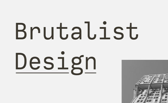
Every day we hear about a number of practices which we can apply to web design but now there is a growing trend in websites which is breaking the industry standard and a more proactive approach known as Brutalist web design. It can also be defined as a functional and “raw” visual aesthetics which is highly influenced by graphic design as well as abandons many trademarks of typical web designs such as headers and footers or conventional menu navigation.

This is a trend which is trending over the internet and not creating clean and tidy websites which would be easy to use as it is quite opposite. In simple words, brutalism in web design uses colors, bold and unusual shapes and layouts along with typography which is generally clumsy and oversized.

There are some brutalism web designs trends which have gain traction over the past years and even Bloomberg has adopted this style in its own way. The name “Brutalism” has been taken from the “brutalist architecture” that features buildings with the large blocks of exposed concrete.

The designers of these sites can display pages intentionally which appear unpolished as well as it can often be uncomfortable for most of the people and users for interacting with. This new style is kind of a welcome response to the generic design practices as well as conventions which typify most of the template based websites.

There are some other features in brutalist web design which include use of basic system fonts, overly large imagery, handwritten HTML as well as unusual scroll and hover effects with web safe colors. It is completely outside the confines of existing accepted design patterns and that’s why many developers are considering these kinds of humorous websites which provides the opportunities for unique user experiences.

But at the moment, it is a down movement but it has got some attention from the users. As soon as the popularity for this unconventional approach is increasing, more retail brands are adopting these brutalist techniques.


  • 0
Impact of Geometry in Web Design

Impact of Geometry in Web Design

Tags : 

Geometry is the visual study of the shapes, sizes, patterns, and positions which simply occurs in all kinds of cultures through these all activities by the human such as:

Building various structures

Machines or motion

Navigation

Various art patterns

Measurements

But the concept of geometry is more than these described points above. For the purpose of understanding the geometric shapes, we first need to know about the organic shapes. Almost everything we notice in our daily life is an organic shape which means that it naturally occurs. Imperfect, irregular or asymmetrical are some other ways of describing these organic shapes. While on the other hand, geometric shapes are uniform and they consist of straight lines and curves.

These geometric shapes can occur naturally in rare and beautiful occasions such as in the form of snowflakes, crystals, and diamonds. In addition to this, geometric shapes have to be designed digitally through a design tool that may be the reason behind incorporating a diamond.

Objectives:

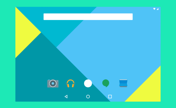
Lines and shapes can be used in order to intuitively guide users as they often make their way with the help of websites such as call-to-action buttons.

These geometric shapes are being used in order to contain vital content such as text or imagery that needs to be highlighted to users.

These are helpful in making a website look more appealing without any overpowering the website design.

Geometric shapes can also be used in order to build a visual identity and that’s why they are becoming more and more common in web designing and they have low bandwidth consumption in comparison to the heavy photos which are generally more detailed and take more time to download.

Use of geometric shapes in web design:

Geometric patterns are big on attention grabbing so we should use a combination of shapes if it is necessary.

We should mix and match the shapes and patterns as certain shapes can complement each other so it should be used wisely. We should make sure that we are using the right colors for helping in creating the right impression.

In general terms, shapes have their own meaning which is associated with it. These shapes can effectively be utilized in website design in order to bring about a stimulus in visitors.


  • 0

Web Design: Deadly Misconceptions that Every Client should Know

Tags : 

Website designing seems very easy to some people, but some find it very difficult. Clients make a number of misconceptions regarding website design. Here we have discussed a few things that can help in understanding different aspects related to web design. Read on to know in detail.

client-web-design-presentation

1. Everyone Can do it
In the world of internet everything seems easy and every Tom, Dick and Harry thinks that he can also design website. But, it is not at all like that. Everyone is not a designer and understanding what will really look beautiful is not at all easy. Tutorials of PhotoShop and knowledge of HTML and CSS is not only enough to make you a designer, you should have the creativity to turn things amazing.

2. New Website will attract new customers
Most of the clients think that by designing a new website they can attract new customers. But, this is totally a wrong conception, as a new website is for the beginners. How can your potential customers know about you, if you launch a new shiny website. They can’t find it on their own; they need an access to it. To approach a wider audience you can choose social media platform.

3. Design should be browser compatible
Website designed should be always compatible on all the browsers like Google Chrome, Firefox or Safari. It should look identical on all the browsers. So developers should properly work on coding.

4. Content
Most of the clients believe that to make their website better they should include a lot of content. But, unfortunately unnecessary content can overwhelm and distract your readers too. Quality content adds a value to the website, but to some extent, so stop putting excess content.

5. Empty space
Empty space available on the website should not be always crammed with content and images. Visual breaks look good on any website. Well planned white space is not a waste space; it is a design element and looks good.

6. Flash intro
Adobe Flash is mostly used by designers for animating banners and buttons during designing a website. But now designers are moving away from it, as it is not at all mobile friendly.


  • 0

Web Design Trends Expected in 2014

Tags : 

With the commencing of New Year comes the hope of looking for new things. We are always excited to know that what 2014 has in its store for changing the World Wide Web. Some of the trends spotted in last year may be followed this year too. Web Designers and business owners want to remain updated with all the latest trends, so that they can reach the pinnacle they are looking for. Read on to know in detail about the trends you can follow in the coming year.

01-Orca-webdesign-trends-2014

Minimalism design
Best usability practices are one of the criteria which would be followed this year too. Cluttering would be avoided and designs would be kept simple or plain. Useless information that is not needed would not be added. Accommodating the needs of customers would be payed heed. Without having excessive design elements the message would be conveyed.

Responsive Layouts
Responsive web design to match all forms of digital media would be carried out in 2014 too. No need of creating another websites for mobile devices. A single code can run perfectly on all environments and at a variety of screen resolutions the content can be rendered easily. Responsive web designs are fluid and no scrolling or recycling is required. It saves the time and money too.

Videos would replace the text
Watching anything is easier than talking out time to read it. To facilitate users more videos and less text would be added. Videos can help in explaining things better. Videos can be shared easily and produced easily on websites. Technical communication becomes easier through videos.

Use of One or Two Colors
Simple color schemes would be used in websites in 2014. One or two colors would be used while designing the website so that it looks simple and easy for the users. Black and white colors would be replaced by blue and other colors. Unique designs would be produced with a simpler look.

Content In short bursts
Instead of long narratives content would be putted in short bursts. Simplified content is expected to dominate in the coming websites.

Long Scrolling pattern
Long scrolling websites with content organized in a much simpler way are expected to appear again this year. Layout would be changing throughout so this would be not at all boring.