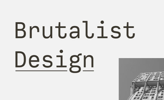
Trend of Brutalism in Web Design
Every day we hear about a number of practices which we can apply to web design but now there is a growing trend in websites which is breaking the industry standard and a more proactive approach known as Brutalist web design. It can also be defined as a functional and “raw” visual aesthetics which is highly influenced by graphic design as well as abandons many trademarks of typical web designs such as headers and footers or conventional menu navigation.
This is a trend which is trending over the internet and not creating clean and tidy websites which would be easy to use as it is quite opposite. In simple words, brutalism in web design uses colors, bold and unusual shapes and layouts along with typography which is generally clumsy and oversized.
There are some brutalism web designs trends which have gain traction over the past years and even Bloomberg has adopted this style in its own way. The name “Brutalism” has been taken from the “brutalist architecture” that features buildings with the large blocks of exposed concrete.
The designers of these sites can display pages intentionally which appear unpolished as well as it can often be uncomfortable for most of the people and users for interacting with. This new style is kind of a welcome response to the generic design practices as well as conventions which typify most of the template based websites.
There are some other features in brutalist web design which include use of basic system fonts, overly large imagery, handwritten HTML as well as unusual scroll and hover effects with web safe colors. It is completely outside the confines of existing accepted design patterns and that’s why many developers are considering these kinds of humorous websites which provides the opportunities for unique user experiences.
But at the moment, it is a down movement but it has got some attention from the users. As soon as the popularity for this unconventional approach is increasing, more retail brands are adopting these brutalist techniques.


