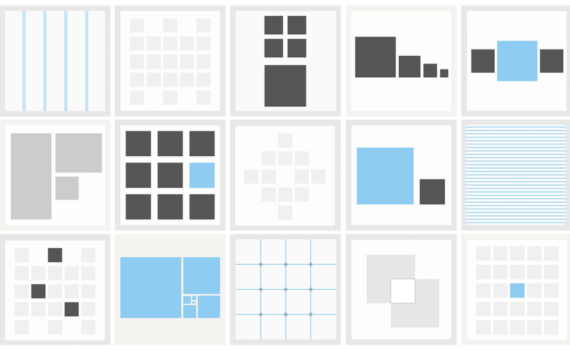
Breaking the Grid Can be Memorable Experiences
The developers who are looking for building the memorable experiences for online stores, balancing creative design with the function user interface is quite a challenge. Most of the clients desire for the site that is helpful in making their products stand out and simultaneously performing in the same way in which the customers wants.
Many established page layouts that rely on the grids are the norm for the most websites but some designers are experimenting by breaking the grids in order to introduce dynamic effects as well as grab the customer’s attention.
Although the traditional grid layouts are worldwide a site that attempts to presents a unique experience can enhance the visibility of the brand as well as boost conversions.
Grid and reasons to break it: We need to learn about the grid itself before breaking it as well as aware of its benefits and drawbacks. In simple words, a grid is a structure through which text and images can be arranged on the screen. The main purpose of the grid is to establish a rhythm and framework for the organization of elements.
Numerous websites which we visit use grids in order to ensure the text, images and white space along with buttons arrangements and sizes which are relative to each other. They are helpful in providing a guideline when designers are wireframing their pages as well as it also defines a visual language which enables users for understanding the content and navigating a website.
Ways for breaking the grid: Designers and developer who approach to the grid rather than an absolute rule, they have the opportunity to perform something different as well as bringing their client’s personality into the design.
Here are a few techniques which we can consider at the time of performing the task of broken grids:
Unusual positioning: The easiest way to break a grid is to position the elements in such a way that are non-relative to each other as well as do not follow a linear layout. By searching many ways in order to arrange the images and texts on a page, designers have the opportunity to build impressive pages which ignore tradition in favor of inventiveness.
Layers should be considered: If we are having the different layering elements on a page, it can give a pleasing collage effect as well as break the grid without sacrificing the unity. When the elements are clustered or overlapped, they would feel connected and can be interpreted as main object.


